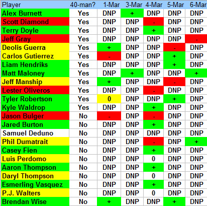
Green (+) is better than average appearance that day, yellow (0) is average appearance that day, red (-) is below average appearance that day, uncolored (DNP) is did not play that day. As players get cut, their dashboard lines will be in italics.
I am also using the same conversion to color the players' names, to see overall performance the spring. I also think that looking at how often someone pitches is important, and as spring training progresses, looking at trends.
Here is the first version including all games (including B games) up to 3/6/12, without any comments. My comments about the bullpen battle can be found here (that was before yesterday's game) :

the next versions will be quantitative, in order to allow for more granularity and objectivity.


No comments:
Post a Comment